Just a quick update of the app design:
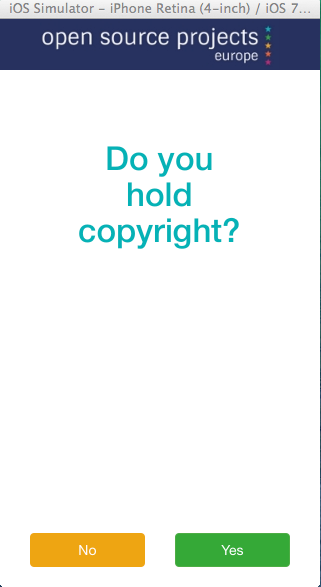
colours all taken from the poster as suggested.
logo changed to open source projects
*text and button colours taken from the stars in the logo
a note re text: when we add the character it will be necessary to reduce the size of the text, I'll use a darker colour at that point to improve readability at a smaller size.